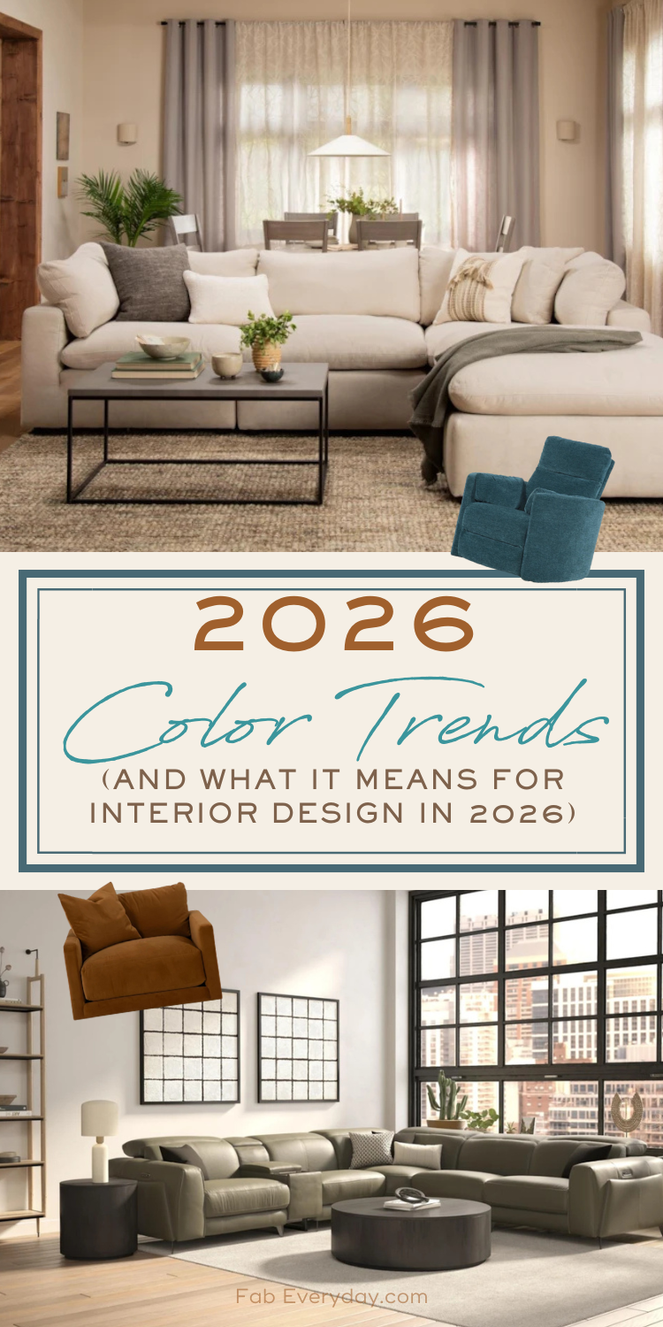
I’m thrilled to welcome back Living Spaces Interior Designer Brynna Joy Evans for another article in Fab Everyday’s interior design series in partnership with Living Spaces! If you’re not familiar with the #FabLiving collaboration, we’ve been working with Living Spaces interior designers to bring you tips and trends for home design and decorating your space for the last several years (click here to see more articles in our #FabLiving collaboration). Now that most major paint and design brands have announced their color forecasts and colors for 2026 (I’m sure you’ve seen some of the discussion around the choice of Cloud Dancer), Brynna is diving into the 2026 color trends and what these color palettes have in store for 2026 interior design trends and 2026 home decor trends. It’s not just the bright and energetic white of Cloud Dancer or the sophisticated statement of Transformative Teal (although those are also key); the 2026 home color trends center around four defining moods: dreamy pastels, bold vibrant reds, rich earthy darks, and warm, cozy neutrals punctuated with striking hits of black or deep brown. Keep reading to learn more and see lots of examples for how to start incorporating them into your home!
2026 Color Trends
By Brynna Joy Evans, Interior Designer, Living Spaces
The rich, grounded hues we’ve been loving aren’t going anywhere in 2026—but they are getting a bright, uplifting twist thanks to Cloud Dancer, Pantone’s Color of the Year. This warm, luminous white brings an energizing clarity that feels like the perfect way to welcome a new year and embrace a crisp, clean beginning.
Soft whites, pastels, and warm sun‑kissed tones are stepping in alongside Cloud Dancer this year, bringing a subtle shimmer to the deep, moody palettes we’ve been living with. And if you’re still devoted to that dramatic vibe, you’re in luck—teal and green continue to anchor the darker side of the spectrum. For 2026, color trends center around four defining moods: dreamy pastels, bold vibrant reds, rich earthy darks, and warm, cozy neutrals punctuated with striking hits of black or deep brown.
It was originally forecasted by World Global Style Network that the color would be:
Transformative Teal. Bold, lush, and bursting with personality, this deep green‑teal is basically the extrovert of the color world. Splash it on a statement wall, toss it into a room with quirky accents, or let it pop against your neutrals—it instantly wakes up your space.
Fun fact: my boyfriend actually picked this exact color for his bedroom—paired with warm walnut finishes, no less. While I was researching this article, he joked, “I created this trend before it was a thing.” We both grew up in the furniture world, so dreaming up our future home together—down to the colors and finishes—is basically a shared hobby. We’re totally on the same page about moody palettes with soft, lighter neutrals sprinkled in. And when it comes to favorites? Olive green and teal win every time. Honestly, take us to any store and we’ll walk out with something green—it’s practically a personality trait at this point.
Now that we’ve explored the colors shaping 2026, let’s bring those palettes to life. I’ve pulled together a curated mix of furniture pieces that embody each style—from the soft charm of pastels to the bold drama of moody earth tones. Think of this as your starter kit for turning those color dreams into actual rooms you can lounge, live, and thrive in. Each piece was chosen to highlight the personality of its palette, making it easier than ever to style a home that feels intentional, inspiring, and totally you.
Dreamy Pastels:
A little nervous about adding color but craving something new? Pastels are the perfect gateway—soft enough to feel safe, yet still bring a gentle pop to a simple style.
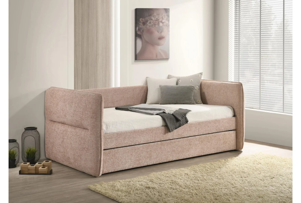
When I think of pastels, I’m instantly transported to my mother’s pastel pink bedroom or the outfits from my childhood. But pastels have grown up—they can feel totally fresh and modern. My friends’ children are obsessed with anything pink, and this mauve shade is the perfect elevated twist. Paired with a funky frame, it adds just the right touch of texture and personality.
Best of all, its timeless shape makes it a piece that transitions from childhood well into adulthood.
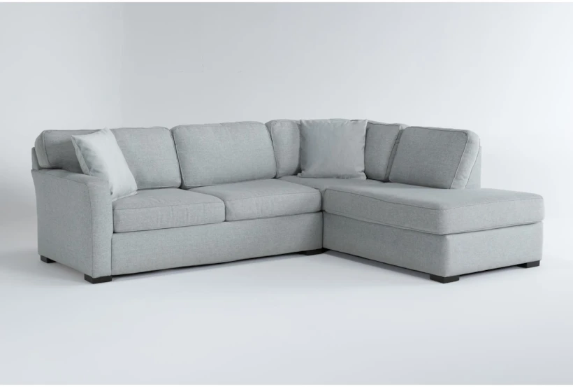
Pastel blue is having a moment — and it’s more modern than ever.
Once reserved for coastal or cottage spaces, this soft hue is now showing up in some of the most contemporary interiors. The secret is all in the pairing. Today’s design trends lean into contrast and clean lines, which gives pale blue a fresh edge. Think: pale blue walls against sharp black accents, warm woods, brushed brass, or textured stone. Instead of reading “sweet,” the color feels calm, elevated, and architectural.
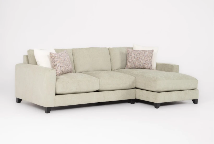
Searching for that perfect retro moment? This adorable sectional nails it. It’s just the right size for a small apartment—and perfect if you’re craving a green statement. Green is a household favorite for us, but even I struggle to work lighter shades into my palette. This one, though, is the ideal spring hue: think fresh grass, flower stems, and all things outdoorsy and bright. Although these shades are often associated with spring, they work beautifully year-round as accents—adding a soft pop of color to dark, moody palettes or warm neutrals.
Sunkissed Reds:
Sunkissed color palettes evoke a deep sense of nostalgia and cultural warmth. Growing up, my grandparents traveled the world and would return with meaningful gifts that reflected each place they visited. Their stories and keepsakes planted the seed for my own adventures, which began with two trips throughout South America and Mexico. There, I was introduced to the vibrancy woven into everyday life—the red brick streets, golden-yellow homes, lush flowers, and hand-crafted pottery.
With my Swiss heritage, I’m also connected to these same hues through traditional attire adorned with rich reds and yellow accents. Together, these experiences continue to shape my design perspective and fuel my love for sunkissed palettes.
Although a pink sofa isn’t for everyone, a muted mauve can be the perfect way to add softness and depth to warm beige tones. It introduces just enough color to feel intentional without overwhelming the space, creating a balanced palette that feels both modern and inviting.
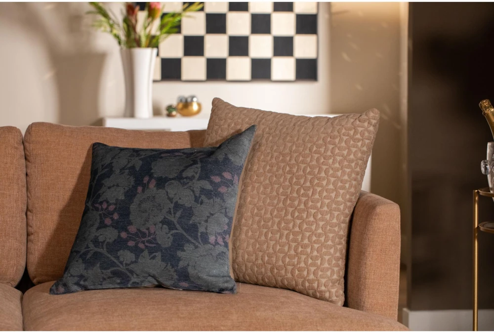
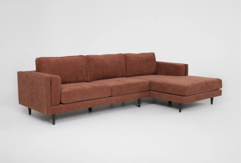
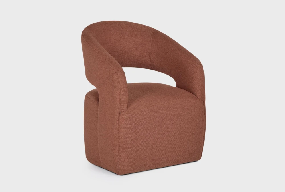
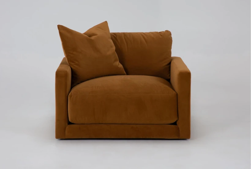
My father has always loved the color orange—a bold choice that, for years, I didn’t fully appreciate. But as I grew into my design career, I began to understand what he intuitively knew: orange, especially in its deeper rusted tones, brings an undeniable warmth and vitality to a space. Rust isn’t just a color; it’s a feeling. It’s the glow of late-afternoon sun, the richness of aged terracotta, and the earthy grounding that instantly makes a room feel lived-in and welcoming.
Incorporating rust into your home doesn’t mean committing to loud or overwhelming color. Start with textiles—a throw pillow, a woven blanket, or a patterned rug with rust threading through it. These softer applications let the color warm the room without dominating it. Rust pairs beautifully with natural materials like oak, walnut, and linen, and it becomes especially striking when layered with warm neutrals, muted greens, or soft creams.
For those ready to go bolder, consider rust colored sectional or dining chairs. These bolder choices can be complemented with wood accents or soft neutrals to help balance the colors throughout the space.
My father’s love for orange taught me that color has personality, and rust, in particular, tells a story of warmth, resilience, and timeless character. When thoughtfully introduced, it elevates a space by grounding it in both comfort and confidence.
Moody Earthtones:
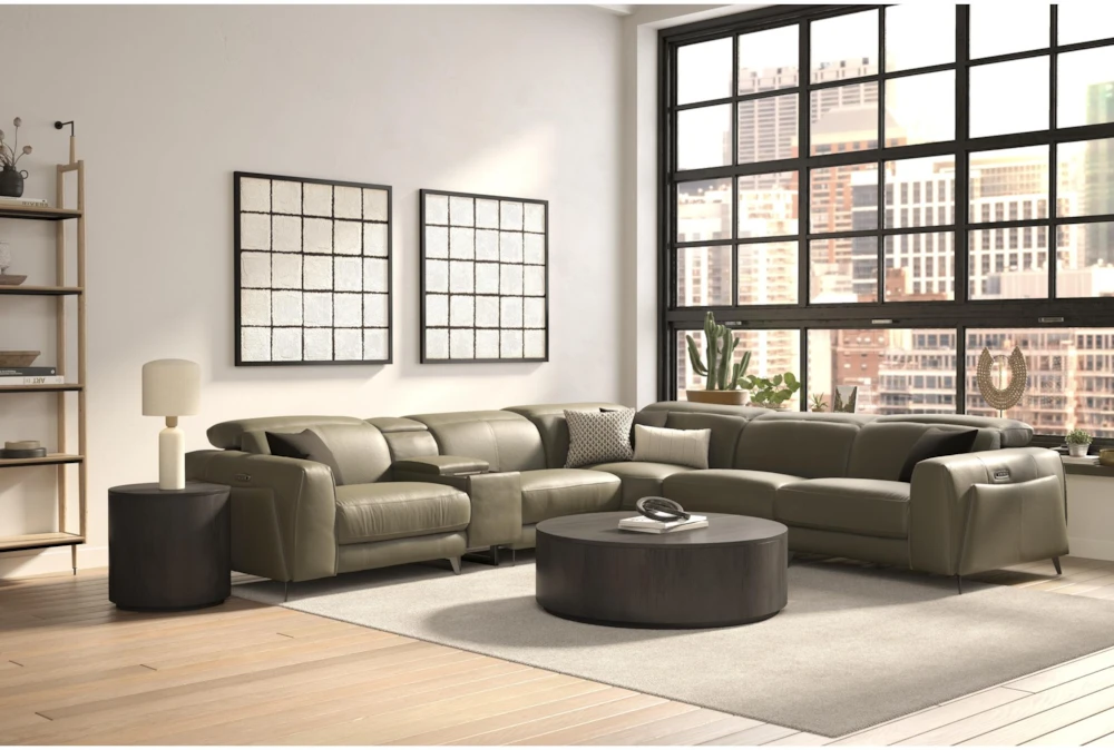
Moody earth tones have continued to be in the spotlight for the last few seasons, offering a rich and immersive palette that transforms interiors with depth, emotion, and sophistication. These colors—deep olive greens, inky teals, charcoals, muted clay, and stormy browns—create spaces that feel grounded, intimate, and effortlessly elegant. And of all the trends emerging right now, moody tones—especially greens and teals—are my absolute favorite. They bring a sense of drama without overwhelming a space, and they layer beautifully with both modern and traditional styles.
Unlike bright or saturated colors that command the spotlight, moody tones speak softly. They draw you in, build atmosphere, and infuse a room with depth and soul. These hues echo what we experience in nature—the calm just before a storm, when everything feels warm, grounded, and deeply connected. Their versatility makes them ideal for furniture, accents, and foundational elements throughout the home. And for those of us who love fall year-round, moody tones offer the perfect way to keep that cozy, autumnal feeling alive in every season.
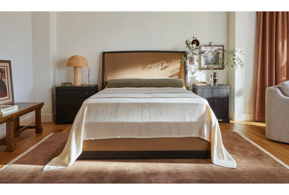
Nate and Jeremiah are masters at balancing airy, light-filled spaces with rich, moody earth tones. Their timeless approach feels both classic and contemporary, making their style resonate across generations and design preferences. Their Estate collection—offered in a warm brown upholstery and a deep, dark brown velvet alternative—creates a stunning statement in any bedroom, adding depth, character, and a sense of refined comfort.
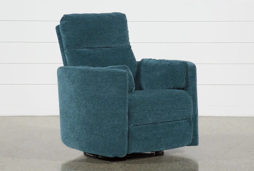
In recent years, many of us have been eagerly waiting for a fresh take on the classic recliner—something that preserves the comfort we love without the dated, bulky silhouettes of the past. As a designer, I’ve often tried to avoid recliners altogether, simply because the available styles felt puffy, oversized, and far from refined.
But the new wave of modern, low-profile recliners has completely changed the landscape. Pieces like the green leather Cullen have quickly become top sellers, and it’s easy to see why. Its warm olive tones and taupe-inspired palette resonate beautifully with today’s earthy, elevated interiors. Sleek black metal legs, a streamlined reclining headrest, and built-in power features cater to modern living while maintaining a sophisticated aesthetic.
This collection proves that you no longer have to choose between comfort and style—you can finally have both in one thoughtfully designed piece.
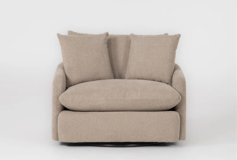
For years, rich leather has been the hallmark of a classic home library—its warm patina, deep browns, and natural texture adding a timeless sense of character. But lately, we’ve seen a shift as more people build personalized libraries and reading nooks in their homes. Designers and homeowners alike are moving toward fabric swivel chairs in moody color palettes, bringing a softer, more contemporary edge to these cozy spaces.
Deep teals, olive greens, charcoal grays, and espresso browns offer the same atmospheric warmth as traditional leather, but with a fresh versatility that complements both modern and classic shelving. The swivel base adds an effortless layer of function, making it easy to turn toward a window, a fireplace, or your latest read. This blend of movement, comfort, and moody elegance has made fabric swivel chairs the new staple for today’s thoughtfully designed home libraries.
Neutrals & Blacks:
Warm earth tones are not leaving—they’re here to stay. Neutral palettes provide the perfect canvas for layering warmth and depth, and adding taupe and black accents can elevate a space with modern sophistication. Taupe introduces a soft, earthy warmth that balances cooler neutrals, while black elements—think sleek metal legs, lighting fixtures, or framed art—create striking contrast and definition. Together, they bring a sense of balance: the room feels cozy yet contemporary, inviting yet visually dynamic. It’s a simple way to warm up a modern interior without losing clean, refined lines.
The Zone Cream Sofa has become a favorite for its versatility and understated style. Its modular design makes it perfect for small apartments, tight entries, or spaces that need flexibility—you can easily rearrange it for movie nights, gatherings, or simply to refresh the room. The soft cream upholstery acts as a neutral canvas, allowing taupe and black accents to stand out and create depth. Pair it with a mix of modern and rustic elements—think a sleek black metal side table alongside a textured wood coffee table—for a layered, curated look that feels both cozy and contemporary.
One of the biggest innovations in upholstery in recent years has been Crypton fabric, and it’s changing how we think about livable, stylish furniture. With pets and kids in the house, finding a fabric that’s stain-resistant, repels spills, and stands up to everyday wear is usually a challenge—but Crypton makes it effortless. The Dream by Crypton sofa at Living Spaces feels luxuriously soft, almost like sinking into a marshmallow, perfect for cozy movie nights or an impromptu nap. Beyond its comfort, its neutral tone provides a versatile backdrop, allowing you to layer in seasonal accents or bold pops of color without missing a beat. Durable, practical, and effortlessly chic, it’s a sofa designed for real life without compromising style.
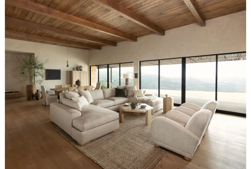
Building on their talent for creating moody, statement-making pieces, Nate and Jeremiah also excel at designing neutrals that bring warmth and balance to any home. Their keen eye ensures every space feels inviting and comfortable—not just for family, but for friends as well. The Voyage Collection embodies this approach, available in both warm brown and light natural tones to harmonize with a variety of interiors. Layered with the Shore Sectional, the collection combines thoughtful design with performance-level upholstery, offering a perfect blend of style, comfort, and functionality throughout the home.
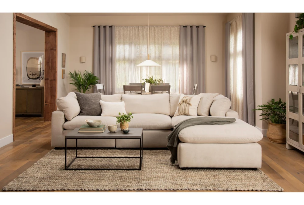
Adding a sectional in a warm linen fabric is an effortless way to infuse comfort and texture into a living space. Linen’s natural weave adds visual interest, while warm tones—think sandy beiges, soft taupes, or muted caramel—create a cozy, inviting atmosphere. Pair it with darker accent pillows, textured throws, or a contrasting rug to define the seating area, and consider positioning the sectional to encourage conversation and flow. This approach balances relaxed comfort with sophisticated style, making the sectional the perfect anchor for both casual family time and stylish entertaining.
Transformative Teal:
Teal is one of those transformative colors that can completely elevate a home, creating spaces that feel both inviting and sophisticated. Growing up with a teal bedroom, I remember how comforting it was to come home to—a color that felt personal, grounding, and endlessly calming. Back then, I chose a lighter shade, but over time I’ve come to appreciate the depth and drama that darker teals bring to a space.
Incorporating teal into your home today can be surprisingly versatile. Darker tones work beautifully on accent walls, creating a moody, enveloping backdrop for lighter furnishings and metallic accents. Sofas, armchairs, or upholstered beds in teal add instant personality without overwhelming the room, while smaller accessories—throw pillows, vases, or rugs—offer pops of the hue that can tie a design together. Teal pairs effortlessly with neutrals, warm woods, brass, and even moody greens, making it a color that feels both timeless and fresh. By layering different shades and textures, teal can transform any room into a space that’s cozy, welcoming, and full of character.
Oversized nursery chairs have quickly become a top seller recently and it’s easy to see why. The rich, inviting teal hue brings a sense of calm and personality to a nursery, while the oversized design offers exceptional comfort for long evenings of feeding, reading, or rocking little ones to sleep. Beyond functionality, the deep teal acts as a striking accent, grounding the space and pairing beautifully with soft neutrals, warm woods, and playful nursery accents. It’s a piece that’s both practical and stylish—a true statement of comfort and design in any nursery.
Cloud Dancer:
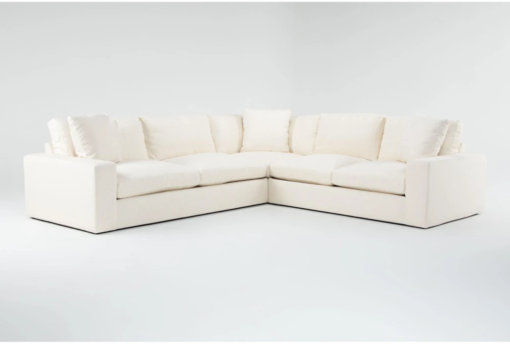
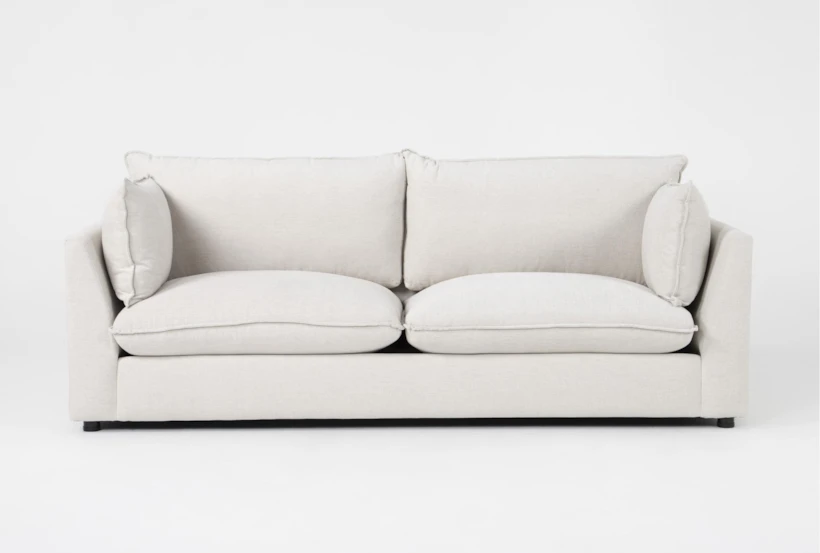
Cloud Dancer is basically the “good vibes only” friend of the color world—soft, bright, and ready to lighten up any room it walks into. Bringing it into your home instantly adds that fresh‑start feeling, like throwing open the windows on the first warm morning. The Cirrus Sofa from Living Spaces is one of the easiest (and dreamiest) ways to bring Cloud Dancer into your home. True to its name, it looks like a cloud that drifted in, got comfy, and decided to stay. This modern take on the cloud‑sofa trend is wrapped in durable performance chenille, making it as practical as it is plush. It’s a total win for busy households—kids, pets, movie marathons, you name it—because you get all the soft, floaty comfort of a cloud with the toughness of performance fabric and feather‑foam cushions that bounce right back.
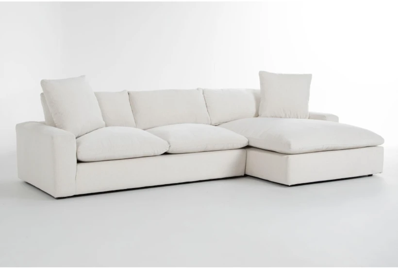
Use Cloud Dancer on walls, pillows, or textured accents to keep things light and breezy, then let the Paloma Sectional be the fluffy centerpiece that ties it all together. The whole vibe is calm, happy, and effortlessly stylish—like living inside your own personal cloud. Because both the sectional and the hue share a clean, calming neutrality, they create a foundation that feels restorative rather than stark. In design, this combination works beautifully as a layered neutral palette: use the Paloma as your anchor piece, then build depth with textures like boucle throws, natural wood accents, and warm metallics. Cloud Dancer on walls or textiles amplifies the sectional’s plush, cloud‑like presence, making the room feel open, bright, and intentionally minimal. To keep the space dynamic, incorporate soft tonal contrasts—think sandy beiges, warm taupes, or muted clay decor—so the white-on-white aesthetic feels curated rather than cold.
As we look ahead to 2026, the color trends offer something for every design style and space. Warm neutrals provide a cozy, timeless foundation, while sunkissed hues bring light and vitality into any room. Soft pastels introduce a touch of playfulness and serenity, and moody earth tones add depth, intimacy, and sophistication. The beauty of this palette is its versatility—you can embrace a single tone to create a focal point, or layer multiple shades to craft a rich, dynamic environment. Whether through furniture, textiles, or accent pieces, incorporating these colors into your home has never been easier, allowing every space to feel thoughtfully curated, inviting, and on-trend.
About the author

Brynna Joy Evans
Interior Designer
I’m Brynna Joy Evans, an Interior Designer and Supervisor of Upholstery and Commercial Design at Living Spaces. I love bringing both residential and commercial spaces to life, blending trends with timeless design to create interiors that are warm, functional, and full of personality.
Growing up in the Bay Area, I developed a deep appreciation for nature, often drawing inspiration from the textures, colors, and landscapes around me. I also cherish spending time with my family, my boyfriend, and little one—these moments inspire my work and remind me of the importance of creating spaces that feel inviting and personal. My dog Mazie is always by my side, whether we’re exploring outdoors on our daily walks or enjoying quiet moments at home. Every project I take on is guided by a desire to craft spaces that are thoughtful, comfortable, and uniquely reflective of the people who live in them.

Leave a Reply